
With over 200 million active websites as of February 2023, the website world has always been crowded. The services you offer can be offered by hundreds of other brands as well. So, what makes the user choose you? The answer lies in two simple words- responsive design. To gain a bigger market share, your web design is the only suit of armor for you.
A responsive web design is a design approach that allows your content to adapt to different screen sizes and desktops. Take a look at how our website is responsive by looking at its display on three different devices:
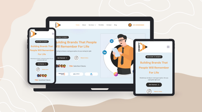
Image: Representation of our website on Mobile Phone, Desktop & Tablet
With a plethora of devices available in the market today, your website should work optimally across all devices.
Gone are the days when visitors hailed a website working on a computer screen. Today, they want the same digital experience on their tablets, smartphones, and laptops. This is evident from the GoodFirms Research on website design stats and trends for small businesses. According to this study, 73.1% of visitors leave a website because of its non-responsive design.
Want to prevent your website from becoming one of those? Then, read this blog about the importance of responsive web design. We will also share some amazing web development tips that can greatly help brands from the perspective of a web design company.
The Importance of Responsive Design
Even with statistics that govern that responsive website design is crucial, many website owners have constantly failed to adopt it. Here are some of the top reasons why you should no longer ignore web design responsiveness:
1.Enhanced Customer Experience
The two most important aspects of any website are its font and images. When you develop a mobile-responsive web page, there is a prospect of increasing font size and line height for improved legibility. It means that readers can easily read on different devices.
Further, a responsive design allows scaling and cropping of images so that images can adapt to the device screen without distortion. This ensures that the overall design of your website is soothing to the viewer’s eyes.
As a result, your users will likely have a positive experience. There will be an increased chance of visitors turning into subscribers, leads, and customers of your product or service.
Moreover, Google also focuses on keeping users happy by showing them the content that they are interested in. So, a responsive web design is an opportunity for your website to rank higher on Google.
2.Simplifies SEO Campaigns
When you have a responsive web page, it is easier to implement SEO as you only need to build one campaign. However, if you have a standalone website for mobile, you will have to double up your resources as you would be required to run two SEO campaigns.
Furthermore, a responsive web page will let you use your time more effectively on competitor research and SEO. It will allow you to improve your search rankings on Google.
3.Improved Scalability
Nobody knows what new device will come next. With technological advancements, new gadgets are coming up every few months with different screen sizes and shapes. A responsive design will help you scale by providing the means to support the latest devices.
As a result, responsive sites will always be ready to fit new screen sizes and standards. It will make your website more accessible and increase your consumer base significantly.
How To Make A Responsive Design?
Now that you know the importance of responsive web designs, it is time to see how you can achieve the same for your websites. Take a look at some of the tips from Degefy, a digital marketing agency in Hyderabad.
1.Use Pre-Built WordPress Themes
If you are a developer or designer who wants to create a responsive web page on an exceptionally tight deadline, pre-built WordPress themes can be your savior. These themes cost-effectively provide beautiful designs compared to designs made from scratch.
You can select from a range of free and paid responsive themes like Twenty Twenty that provide features like customization. All you have to do is pick the theme you like the most and customize colors, fonts, social icons, and other variables as per the brand guidelines.
2.Customized Website
If you have time on your hands, building a website from scratch can be a good idea. Unlike pre-designed templates, the custom-built website allows you to tailor the design of your website according to the website content, branding, and other brand requirements.
Every element, like the layout, color scheme, typography, and imagery, can be carefully chosen to reflect the client’s identity and message. This also ensures that the website layout, font, and images are created in a way that adapts to different screen sizes and resolutions. Thus, your web page remains visually appealing and functional across any device you wish to use.
3.Choosing The Best Option To Build Websites
Web development is constantly evolving. Today, there are multiple options to build a website, like WordPress, React, HTML, and Angular. But choosing the one that helps you design a responsive design can be tough. Let us look at the comparison table between these top 4 to decide which is best for your website development needs.
| ASPECT | HTML | WordPress | Angular | React |
| Learning Curve | Requires coding knowledge | Can be used by non-coders | Requires understanding of TypeScript | Requires familiarity with HTML, CSS, and Javascript |
| Type of websites | Useful in designing static websites | Useful in designing simple, content-rich websites | Useful for feature-rich websites | Useful for interactive websites |
| Mobile Responsiveness | Requires additional effort | Built-in with some templates | Requires additional effort | Requires additional effort |
| User Interface | Several lines of code can make it messy | Easy-to-use with drag-and-drop features | Several in-built functionalities make it difficult to use | Easier to use as compared to Angular |
| Performance | Relatively slow | Slow due to plugins and themes | Regular DOM makes performance slow | Virtual DOM makes performance faster |
HTML, while fundamental, requires additional effort for responsive design. WordPress offers built-in responsiveness, making it an excellent choice for ease of use and SEO capabilities. Angular and React are robust JavaScript frameworks with strong community support, making them ideal for creating responsive web applications. Ultimately, choosing between them depends on your project requirements and the development team’s skills.
Test Responsiveness Of Your Website
Once your website is ready, it is important to test it for responsiveness. This will give you an idea of whether your website is mobile-friendly or not. The most simple way of testing your website is using Google’s mobile-friendly test. All you have to do is enter the URL or code of your website. Then, click on the test URL or test code option. Within a few minutes, it will give the results on how easily a user can navigate your website using a mobile phone.
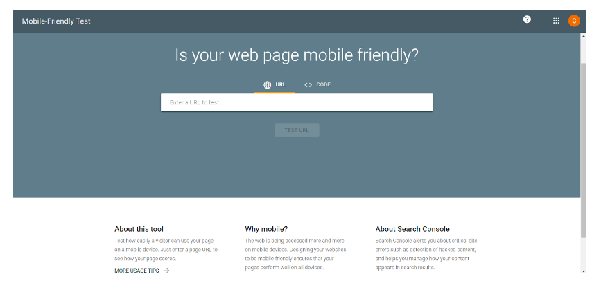
Image: A look of Google’s Mobile-Friendly Test page
The next step is to test your website for multiple screen sizes. You can do this using Chrome’s Developer Tools by integrating an emulation feature called Device Mode. This mode changes the resolution of your website page to reflect different mobile devices like Samsung, Apple, and more.
Wrap Up
Today, we require websites that are future-ready to adapt to the new devices as and when they launch. This is only possible with a responsive web page. At Degefy, we offer web design services with good wireframes and content flow so that you can stand above your competitors.
Get in touch with us today, and let us help you with SEO-rich web content development, website designing, design wireframes, and custom website development.